
Role: Solo UX/UI Designer
Timeline: 1 month (Dec 2023)
Tools: Figma, Illustrator & Photoshop

Project Overview
This project focuses on enhancing the user experience of the Zara app. Despite its popularity, Zara's app falls short of industry standards and user expectations. To address this, I redesigned key sections of the app, particularly the search and purchase process. The goal is to improve functionality and demonstrate the impact of user-centered design on digital experiences.
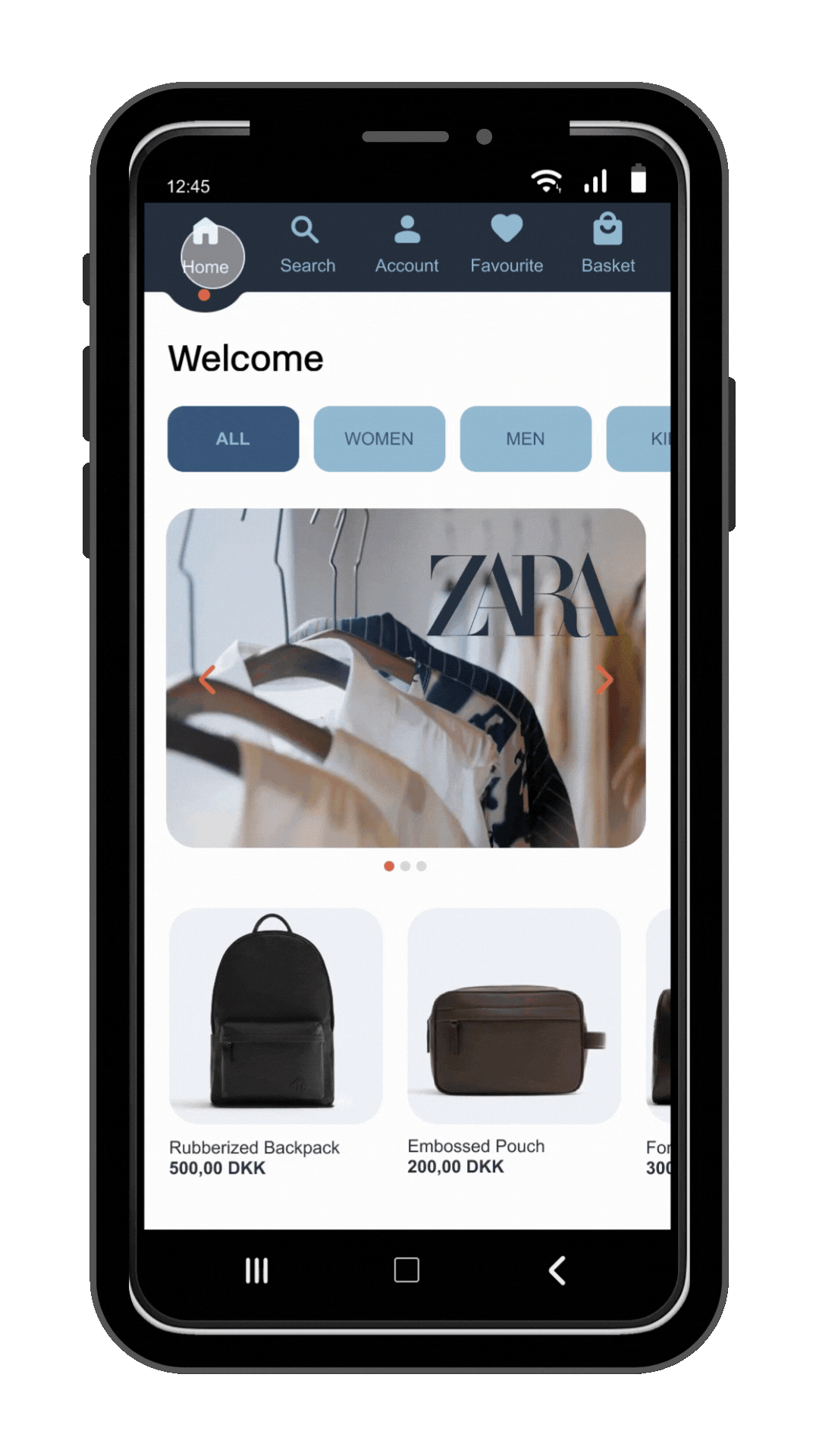
Check out the redesigned Zara app in action here.
Problem Statement
The Zara mobile app has visual and usability issues. I redesigned select app pages, excluding the website, using a user-centric design approach to address these issues by understanding user needs and enhancing interaction.

1. Confusing Navigation:
The menu is messy and difficult to navigate.
2. Impractical First Page:
The first page of the Zara app features fullscreen images that are eye-catching but sacrifice functionality for beauty.
3. Price Hierarchy Issues:
Price information lacks emphasis and hierarchy.
4. Unclear Search Bar:
The search bar is unclear and lost among model pictures in the menu.
Project Goal
-
Improve usability, accessibility, and visual appeal.
-
Simplify the layout to reduce information overload.
-
Clarify navigation.
Design Process
I applied the design thinking process to understanding user needs, ideating solutions, and iterating designs based on feedback. By following this method, I was able to empathize with users, identify pain points in the Zara app, and iteratively design improvements that address their needs effectively.
Empathize
Define
Ideate
Prototype
Test
User Testing Insights on the Zara App
I conducted 20-minute tests with two new users of the Zara app. Both struggled to find the sign-up page in the ‘Account’ tab. One faced technical issues, while the other took unconventional routes to find jeans. One user completed the purchase smoothly, but the other gave up after not finding men’s jeans, highlighting key issues with sign-up and navigation.
Empathy Map
After testing the Zara app, I created Figma empathy maps for users John and Andrew. They were frustrated by unclear guidance, poor visual hierarchy, and disorganised menus, leading them to improvise product searches—revealing a need for interface and UX improvements.
-
Frustrated by hard-to-find sign-up page.
-
Annoyed by wasted time during sign-up.
-
Displeased with app design issues.
-
Dissatisfied with a slow jeans search.
-
Confused by the jeans selection process.
-
Happy with the easy purchase process.
-
Taps buttons to find the sign-up page.
-
Taps buttons and slides images to find sign-up.
-
Can't find Gmail or Facebook sign-up options.
-
Misses password requirements and receives an error.
-
Spends 5 minutes on an unsuccessful sign-up.
-
Taps around to find jeans.
-
Completes the purchase of jeans smoothly.
-
Size options should be on the product page.
-
Calls the app "stupid" for a hard-to-find sign-up.
-
The white background makes items hard to locate.
-
Prefers Zalando for a better shopping experience.
-
Would quit the app if not for the interview.
-
Suggests adding Gmail and Facebook for sign-up.
-
Menu is disorganized and navigation unclear.
-
Considers the app unusable due to its interface.
-
Brings the mobile close to find info.
-
Finds the sign-up page in the account section.
-
Fills out the sign-up form and accepts the policy.
-
Taps the sign-up button multiple times, but it fails.
-
Selects 'Home' and 'View Categories' to find jeans.
SAYS
THINKS
DOSE
FEELS
JOHN
-
Expects the Sign-up page on the Home tab.
-
Tries various keywords to find jeans.
-
Spends 4 minutes searching for jeans, but doesn’t find any.
-
Didn’t notice the menu, affecting his experience.
-
Can complete a purchase when prompted.
-
Clear on the sign-up page requirements.
-
Finds the sign-up page quickly.
-
Checks the top, then the bottom of the page for navigation.
-
Taps the menu, then the search bar to find jeans.
-
Searches "Jeans," "Pants," and "Men Jeans" (no results).
-
Tries "Lee" but only sees women's pants.
-
Gives up on finding the jeans.
SAYS
-
Shops online via Google, Pricerunner, Zalando.
-
Prefers computer over mobile for shopping.
-
Expects navigation bar at the top.
-
Frustrated by broken search bar.
-
Dislikes layout, small text, and lacks icons.
-
Won’t return unless the app offers something unique.
-
Satisfied with quick sign-up.
-
Search is helpful, but confusing later.
-
Annoyed by failed search results.
-
Thinks there are no men’s jeans.
-
Satisfied with easy purchase process.
-
Happy with smooth sign-up.
FEELS
THINKS
DOSE
Andrew
User Persona
created two personas using empathy maps and research to illustrate diverse user needs for the GreenMatch Solar Quote Form. Crafting personas helped me understand users, prioritise features, and design for a better user experience.
Goals:
-
Sign up quickly and easily.
-
Find jeans at the cheapest price.
-
Shop online to save time.
Pain Points:
-
Can’t sign up in the app.
-
Struggled to find jeans.
-
Spent too much time locating and purchasing clothes.
Background:
John, 40, lives in Copenhagen and has a busy work schedule, making in-store shopping difficult. He prefers shopping online for its speed and convenience, especially using a website on his computer for the larger screen. He’s comfortable using mobile apps but opts for the website for clothing purchases.
Goals:
-
Sign up quickly and easily.
-
Find jeans at the lowest price.
Pain Points:
-
Can’t find jeans using search.
-
Spends too much time searching for jeans.
-
First page doesn’t clarify the app’s purpose.
Background:
Andrew, 60, lives in Copenhagen and has a full-time job, which keeps him busy. He shops both in-store and online, preferring online shopping when he's short on time or looking for better prices. He’s comfortable using both mobile and web apps for clothes shopping.
Behaviours:
-
Didn’t notice the signup page placement.
-
Tapped multiple areas to complete the task.
-
Became frustrated when unable to find what he wanted.
Behaviours:
-
Didn’t notice gender categories in the menu.
Used search instead of the menu to find jeans.
-
Tried multiple keywords but couldn’t find jeans.
JOHN
Andrew
User Journey Map
I used user journey mapping to create a holistic view of the entire user experience, focusing on the sequence of actions and touchpoints users encounter. It helps identify pain points, optimise touchpoints, and uncover opportunities for enhancing the overall user journey.
User steps
Awareness
Find the Sign up page
(Less than a minute)
The Sign up process
( Max 3 minute)
Find men's jeans.
(Max 1 minute)
Goals
-
Find the best price online
-
Save time by shopping online
-
Buy without issues in a short time
-
Sign up easily and quickly
-
Quick sign-up with minimal info
-
Find jeans easily and purchase without problems
Behaviours
-
Prefers Zalando over Zara for better prices.
-
Shops online for better deals and time savings.
-
Uses Zalando, Google, and Pricerunner to find the cheapest prices.
-
Taps all tabs to find the sign-up page in the "Account" tab.
-
Expects the sign-up page on the home page.
Looks at the top of the -
page for navigation, then checks the bottom.
-
Fills out sign-up form and accepts privacy policy.
Wants Gmail/Facebook sign-up options.
Taps bottom navigation to find sign-up.
Signs up easily.
-
Taps around the app to find jeans.
-
Uses "Home" and "View All Categories" to look for jeans.
-
Prefers using search to find products.
The Purchase Process
(Max 3 minute)
-
Find purchase options and complete purchases easily.
-
Chooses jeans, taps buy, and completes purchase easily.
-
Can buy any product in the app without issues.
Touchpoints
-
Learns about the app through word of mouth.
-
Finds a product via Google search, leading to Zara app.
-
Installs the app on their phone.
-
To sign up, tap the "Account" tab in thenavigation bar.
-
Fill out the sign-up form and agree to the privacy policy to complete the sign-up.
-
Tap "Menu" and then "Jeans."
-
Select the type of jeans and choose the pair you want.
-
Tap "Add" and select the size.
-
Tap "View" and then "Buy."
-
Fill in required info to complete the purchase.
Pain Points
-
The first page doesn't explain what the app is about.
-
PriceRunner and Google offer more price options than Zara.
-
Zalando is easier to use than Zara.
-
He couldn't find the sign-up page easily.
-
He taps on many tabs to find it.
-
He expects the sign-up page to be on the Home tab.
-
He says he would stop using the app if it weren't for the interview.
-
The sign-up process wasn't user-friendly.
-
He couldn't find a quick sign-up option with Gmail or Facebook.
-
Menu is disorganized.
-
Search input doesn't work.
-
Couldn't find men's jeans.
-
App is confusing and lacks guidance.
-
Sizes should be visible on the page, no need to click 'Add' for options.
User Feeling
-
Likes the image quality, but they don't show the app's purpose clearly.
-
Thinks the app design has many issues.
-
Calls the app "stupid" for not finding the sign-up page quickly.
-
Feels the service is bad due to the sign-up page being hard to find.
-
Feels satisfied when he finds the sign-up page quickly.
-
Annoyed by wasting time and being unable to sign up.
-
Happy with the smooth sign-up process.
-
Finding jeans takes too long.
-
Gets confused.
-
Search starts easy but gets harder.
-
Annoyed by poor search results.
-
Happy with the easy purchase process.
Opportunities
-
Improve Zara app usability to increase user engagement.
-
Make the first page clearly show it's a clothing store.
-
Make the sign-up option more noticeable.
-
Improve the navigation bar’s placement and design.
-
Reduce sign-up time.
-
Simplify the sign-up form.
-
Make sign-up requirements clear.
-
Make finding jeans easier.
-
Improve search to work with various keywords.
-
Simplify product discovery.
-
Make size options visible on the product page.
Competitive Analysis
During user testing, both participants preferred Zalando for its wide brand selection and easy interface. I did a competitive analysis of the Zara app to find areas for improvement. The analysis showed Zalando's better visual hierarchy, navigation, and clearer processes. Based on this, I suggested these improvements for the Zara app:
-
Improve visual hierarchy
-
Add visual cues/icons for better menu navigation
-
Use larger, readable fonts
-
Optimize color contrast
-
Simplify sign-up with social media integration
Company Name
Ease of Sign-Up
Ease of Account Creation
Ease of Finding a Product
Ease of Finding a Product
Similarities
-
Both apps have a website & mobile app
-
Both sell fashion products
Differences
-
Zalando: Multi-brand fashion marketplace
-
Zara: Limited to only Zara products
Comparison: Existing Zara App vs. Redesigned Flow
I created flowcharts to compare the current Zara app with my redesign. Key improvements include
-
Sign-up process: Adding Google/Facebook sign-up for quicker registration.
-
Home page: Featuring main categories for easier navigation, instead of a full-screen image.
-
Sub-menu: Separating categories for clearer organisation, unlike the current combined menu.
Existing Zara App Flow
Start
Home
(with Clear Categories)
Menu
Log In
Select Product
Choose Category
Enter Email/Password
Sign Up
Choose Size/Quantity
Complete Purchase
Checkout
Add to Basket
Finish
Start
Home
(with Clear Categories)
Social Media
Sign-Up Option
Redesigned Zara App Flow
Add to Basket
Select Size/
Quantity
Select Product
Checkout
Complete Purchase
Finish
Digital Wireframe

Prototyping

Style Guide
Typography
Aa New Rail Alphabet
Header 1
Medium, 25pt
Header 2
Medium, 20pt
Body text
Medium, 18pt
Body text
Medium, 12pt
Body text
Bold, 12pt
Color Plate
Primary Colors
#3C587B
#94BBD1
Secondary Colors
#DAF3F4
#28303E
Tertiary Color
#E56A4F
Background Color
#FFFFFF
Text Colors
#00000
#3C587B
#94BBD1
Buttons
Primary Button
Secondary Buttons
Tertiary Buttons
Inputs / Form Elements
Mobile Keyboard

UI Components
Menu Bar (Navigation Bar)

Product Menu

Usability Study Insights
-
Positive Feedback:
-
Users appreciated the dynamic visuals and smooth navigation.
-
The app was found intuitive, with clear category placement and readable text.
-
Areas for Improvement:
-
Relocate the search button for better visibility.
-
Add sorting options for products.
-
Include a size guide on product pages.
What I would do differently
-
Earlier User Testing – Conduct usability tests earlier to refine designs faster.
-
More User Feedback – Involve a larger group of users for diverse insights.
-
Expanded Design Scope – Prototype and test additional app sections for a more seamless user flow.
-
Refined Iterations – Conduct multiple rounds of testing and improvements for a polished experience.
